Monday, February 15, 2010

Get Your Stars On

close up
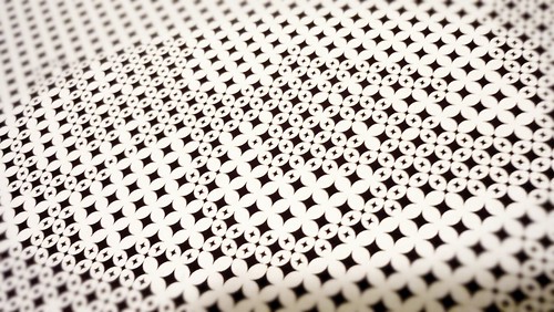
Detail of the star-dot pattern

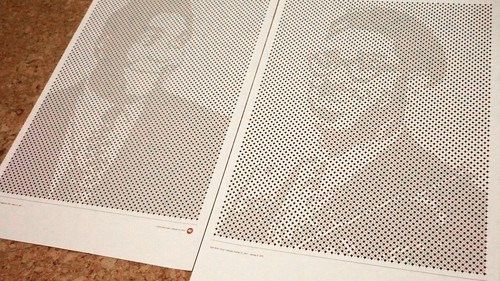
Recently, I've been reading more design blogs than writing anything. One inspiring piece I happened upon via Coudal, via Ministry of Type, were these star patterned posters created by Mark Brooks. I've played with hand-tooling half-toned patterns before and always planned a series of portraits using a labourious dot technique I developed working on a 3D project. Yet this technique seemed so straight-forward and provided a nice level of visual abstraction that's hard to resist. As a quickie I did these tests of Dizzy Gillespie and Charlie Parker (I plan to do the other three members of the famous "Quintet"). These turned out well enough I may even get them printed somewhere as more finished pieces than my Epson can do at home.

posters
The posters printed at 13" x 19"

Labels: , ,

Sunday, January 24, 2010

curaTOrial


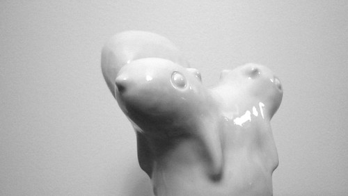
Two-headed Squirrel by Chevaux de Bois, won at Come Up To Room

It's a busy weekend for a designer in Toronto this weekend. There's the Interior Design Show, the Toronto International Design Festival, and smaller exhibitions like the Gladstone's Come Up to My Room and Made's Radiant Dark. There's simply too much to do. We managed to see a lecture by Tobias Wong and Cynthia Hathaway at Harbourfront and I managed to get to the Gladstone but that's it.

Otherwise, it's a typical Toronto weekend. Cold. Wet. Grey. Construction on Queen St. W. Confused (utterly confused) TTC bus drivers. Re-routed street cars. Such an ugly time of year to have company visiting.

Labels: , ,

Thursday, December 31, 2009

Too Good for T.O.


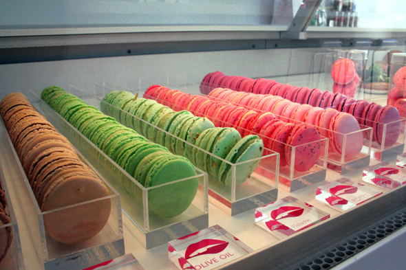
image via BlogTO

Recently I dropped into Nadege Patisserie on Queen West to pick up a paintbox mix of their incredible biscuits (flourless by the way). A special something for a special someone. My first thought was that this was a nice place, particularly by Toronto standards. After tasting some of these Marie Antoinettes (really?) my next thought was, "this place is too good for Toronto".

Yes. This place is so good, you'd expect it to be somewhere like New York or London or maybe even Paris. But Toronto? Really? Then I had another thought, there area a few things that Toronto, a city bereft of any design sense, despite being a center of design activity economically, just doesn't appreciate or deserve. Like the Japanese Paper Place also on Queen. This exceptional shop has been bringing some of the finest handmade papers from Japan and Italy for years without barely a peep. Swipe Books on Richmond is another exceptional store for both it's inventory and knowledgeable staff that gets nary a mention around town. Coach House Press. Ed Burtynsky's Image Works. Hariri Pontarini's McKinsey & Company Toronto Office. All examples of things that this town doesn't deserve.

Of course, there are a lot more things that actually are not good enough for Toronto. Things like the TTC, cycling lanes, storm sewer infrastructure, the municipal government, are all sub-par for a city of Toronto's size and economic importance.

So please, Toronto. Don't screw up the good stuff and let's try to make the crappy stuff better.

Labels: ,

Monday, July 20, 2009

DIY Dumpster Pools

Yeah... the New York kids are pretty cool what with their dumpster/swimming pool parties. Actually, making a pool from an old dumpster seems incredibly appropriate for Toronto this summer seeing as the civic workers' strike has closed public pools and canceled garbage pick up. The solution? Fill a dumpster with water of course. This idea comes courtesy of Macro-sea all in the name of reclaiming unused urban space. Geesh, couldn't you just plant a couple of trees or something?


image via Readymade

PS. I would've used the obvious "Dumpster Diving" title - but someone already did that.

Labels: ,

Friday, July 17, 2009

In Milton's Words

A few days ago I missed what was apparently an intriguing discussion on CBC radio with preeminent graphic designer, Milton Glaser. Parts of CBC are forward enough to make all of their content available online, other parts aren't and can never overcome certain restrictions of use. Instead of listening to the CBC interview, I found this video, recorded over ten years ago as part of TED and posted below. It's great to hear and see Glaser's process as he discusses several posters and how the final design came to be:

Labels:

Tuesday, June 23, 2009

It's Tomorrow in Japan


Just found this calendar created for Uniqlo via spfdesign

See the full screen version at Uniqlo.com

Labels: ,

Sunday, June 21, 2009

Updates (eventually, finally)


Years ago, I created a Web site that I could easily update whenever I had a chance, then I discovered I never had a chance. In fact, making additions to the site wasn't difficult but choosing images and writing descriptions was. Now after at least two years of gathering dust, I've tidied up a bit. I've added several more recent projects under the "Folio" section that better reflect what I've been doing lately.

I also discovered I probably need to update more than a few images as the site itself is groaning under some rather untidy HTML & CSS but that's another project entirely (like cleaning out the gutters and eaves troughs it's a thankless job with little visual benefit at all but someone's got to do it).

Thank you for your patience.

Labels:

Thursday, May 7, 2009

Da(y)tum

Chip Kidd has said that if designers want to control their work, they should create their own content. But this isn't about Mr. Kidd it's about another designer busy creating his own content. For reasons known only to himself, Nicholas Felton began recording his daily routine and since 2005 has published the data in his popular Feltron Annual Report. From this emerged the site daytum.com. CBC's Nora Young recently spoke to Felton about the Daytum project. You can hear an excerpt: click here to hear or listen to the full interview at the Spark Web site.

Labels: ,

Sunday, February 8, 2009

Designers Walk


Thout's "forkedUP", wall tile for storing your utensils

It's been a busy week in T.O. for design shows. A lot of smaller galleries create shows to take advantage of the design buzz created by the larger interior design show. For the last few years I've avoided the trade show and its fish bowls full of business cards and taken in lower-key shows like Made Design's Radiant Dark and The Gladstone Hotel's Come Up to My Room. A bonus this year was Thout's temporary showroom space of new furniture pieces. The convenience for us has been all of these shows were within a few minutes walk of each other on West Queen West. As chain stores like H&M, Zara, The Gap etc etc replace independent book sellers and vintage clothing shops on Queen West, the blocks West of Shaw that make up the West Queen West strip continue to be a great way to find secular inspiration on a Sunday afternoon.

Photos of Thout's showroom
Photos from Come Up To My Room

Labels: , ,

Wednesday, February 4, 2009

Through a Glass (radiant) Dark(ly)


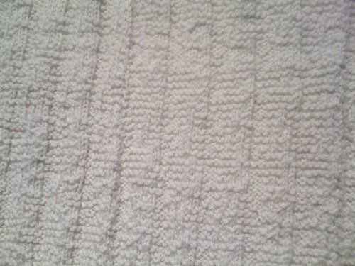
Snowcover blanket by Angela Iarocci. The blanket's pattern was created using thirty years of snow depth data of a dozen Canadian cities from Environment Canada.

Made Design's Radiant Dark '09 is currently on show in Toronto. Radiant Dark seeks to showcase new works of Canadian design by building an exhibit around a general theme. This year's theme: Elegant Corruptions.

What struck me most about this exhibit is how Made has assembled a unique cadre of uniquely divergent but strangely like-minded designers who are exploring not just new materials and forms but also new roles for designers. See more photos here

Labels: ,

Tuesday, January 13, 2009

Things You Find When You Aren't Looking

Things like this video from the TED site:


If I could draw like this, I might never touch a computer again. Well, maybe to read e-mail and stuff...

Labels: , ,

Thursday, January 8, 2009

When I Grow Up


When I grow up, I'd like to work for the good people at Criterion.

Thank You.

Labels: , ,

Wednesday, January 7, 2009

Kidd Stuff


Though I'd seen this interview with Chip Kidd before I somehow had forgotten about it. Or maybe I'd seen photos of the apartment sometime ago in the New York Times style section? Either way, it has resurfaced here on Wired.com. Be sure to stick around for the end of the interview when you'll see Mr. Kidd fronting his band Artbreak.

Labels: , , ,

Tuesday, September 16, 2008

The End of the (old) Web


Whoa. Hold the mayo. When did Amazon get rid of their infamous tab navigation? Was I asleep? Was I in a coma and missed the press release? I'm not sure how IE 6 users see Amazon these days, but I'm seeing a vast improvement in this simple change. One of the most significant changes will be that people (clients?) won't be able to point to a major Web site and say, "they do it, so we can too." The tab metaphor is an extremely useful one, and as an interaction tool it is priceless. Yet, it is limited and Amazon was the clearest example of that (remember the stacked tabs?) despite that they may have been the primary reason for the popularity of tabs online (debatable I suppose).

It's a relief to see Amazon finally drop the tab navigation, but there's still plenty of work to do.

Labels: ,

Saturday, August 9, 2008

French for Fun


Of course, I'd heard of Jacques Tati… well, okay, I hadn't really heard of him so much as I'd seen the well designed DVD covers at the video store. After reading about Tati's films I thought I'd see what was inside those attractive cases. "Play Time" by Tati revels in placing his Mr. Bean-like character, Monsieur Hulot in an overwhelmingly modernist Paris. The film plays out almost like a black and white silent movie, though really it's just mostly wordless with a subtly coloured palette.

While the movie is basically a setting for Mr. Hulot's visual gags and misadventures (when there is dialogue, it's almost awkward), the over riding theme is the impersonal and alienating nature of modernism. One side story shows an American tourist hoping to find the "real" Paris but only occasionally catches glimpses of landmarks as reflections in shop windows or glass doors (a travel agency shows posters for Mexico, New York, Rome and London, all with identical architecture).

Even though the city is portrayed as cold and stark, I couldn't help but enjoy the minimally furnished rooms and openness created by large pane glass windows. Even more remarkable is that all the incredible sets were created for the film (this is one time when the DVD extras have to be seen). In the last part of the film, Tati has fun at a designer's expense by showcasing a new restaurant where the design wreaks havoc on the staff and customers. Despite all that, Tati reveals his love of the city when the incredibly choreographed ending culminates with the bustling traffic and crowds turn Paris into a circus.

Watch a clip from Play Time

Labels: ,

Tuesday, July 1, 2008

FishNet News


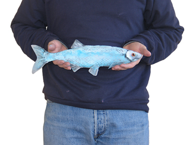
While FishNet may be gone, it's far from forgotten. After all, the National Post named the exhibit one of the Top Five Things to do in Toronto (right after Star Trek: The Musical). The exhibition ended June 22, but some of the remaining fish are on display in the Harbourfront Centre's shop, Bounty. The shop will also continuing "releasing" the fish as explained by Angela in this interview from May for the Ontario Waterkeeper's weekly podcast:


Mentioned:
FishNet: The Great Lakes Craft and Release Project
Harbourfront Centre
Ontario Waterkeepers

Labels: , ,

Monday, May 5, 2008

Great Lake Swimmers


photo: Bernice Iarocci
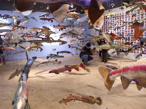
Our colleagues, Angela Iarocci and Claire Ironside at moimoi design have been busy. Really busy. Busy on a project that expresses the diversity and fragility of the Great Lakes bioregion. Over 2000 students, educators, artists and designers have been brought together through Project Fishnet to create over 1200 textile fish now exhibited at Harbourfront Centre in Toronto. Angela and Claire have been working at a pace that would make James Brown look like lazy. That pace hit a fever pitch in the last two weeks as volunteers were culled from every corner, photos were Photoshopped, graphics were printed and fish were strung. The show opened last Friday and from everything I saw it was a hit. I think some of the hard-core art folk were a little taken aback by the presence of so many kids, though that didn't stop them from polishing off the punch bowl (oh yeah, ol' skool punch bowl).

Check out the Fishnet Web site, and gallery of fish crafted by artists and kids alike (including your humble author).

Labels: , , ,

Monday, April 28, 2008

Carnegie Mellon-heads


What do you get when you mix a Carnegie Mellon Ph.D grad student with a Wii remote? A $50 multi-touch display, that's what. See what Johnny Lee is up to.

I want my Wii TV!


From the Wired Blog, "Think of it as a poor man's Wacom Cintiq." I will and I must!

Check out Johnny Lee's project page.

Labels: , ,

Sunday, April 6, 2008

Resistance is Useless

Douglas Adams U/X

Recently, I saw The Hitchhiker's Guide to the Galaxy on television. Not the BBC series, but the feature film. I have to say, I really enjoyed it more the second time than when I first saw it. I don't know why. Lately, I've been referring to the Guide in my work. I just love the whimsy of the animations and well, the "flatness" of the interface. Say a word, get a description (even if the description is only two words; "Mostly harmless"). In any case I've decided to collect fun movie application interfaces for handy reference. This scene shows Guide entries for both the Vogons and the Babelfish:

This 9.1 MB QT movie may take a moment to load
aka H2G2

Labels: , ,

Friday, February 22, 2008

Mind the Gap


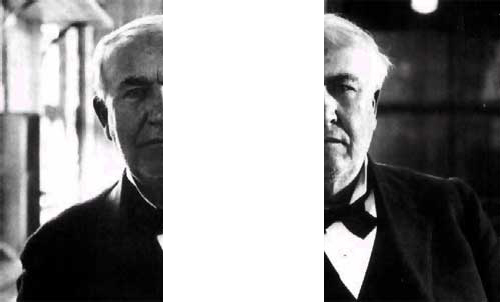
Is Yahoo going to get got by M$? Doesn't matter really. They're both sucking wind – according to Brian Milner of the Globe & Mail. Of course, with revenues in the billions of dollars, when you suck wind, you suck all the air out of the room. What Milner is talking about is what Francis McInerney calls the Edison Gap. Which, as anyone who has worked for a tech company would recognize, is the common and natural habit of spending far too much on R&D compared to revenues. But what's a company to do? As a designer, I want every company to spend all their cash flow on R&D. Isn't that a good thing? Apparently not. Turns out, you should only spend as much on R&D as you can afford.

"The Edison Gap is a related performance measure that refers to the financial hole technology companies dig for themselves when they allow spending on research and development to outstrip operating profits. That's likely to happen when cash velocity is low and the flow of information slow."


This nugget of information coincided with reading that Yahoo! has folded up their Yahoo! Design Innovation team and had laid off everyone working there. Unfortunately, we were the benefactors of their innovative work rather than their bottom line. I guess if your profits are thinning and you keep spending on fancy stuff you can't use, then, you're in trouble. In short, Yahoo! is trying to decrease their "Edison Gap". I remember when Nortel tried to decrease their Edison Gap by laying waste to their design group. It didn't work out so well for Nortel which is still floundering after years of attempting a turnaround. Is that Yahoo's fate?

I guess this wouldn't easily happen to Google Labs because they would have to spend a bloody great heap of money on anything before they close in on their incredible revenues. Oddly, McInerney gives Apple full marks for getting the formula right. It seems Apple's R&D costs are proportionately half that of Microsoft's. Quality vs Quantity?

Labels: ,

Monday, February 11, 2008

Muji vs DWR


Muji ad

Let Soho have Muji, Toronto's getting a DWR.

...ok, I'd still prefer a Muji shop in T.O.

Labels:

Sunday, November 18, 2007


Thout's Old School Table

Every week or so I consider canceling my Saturday subscription to the Globe and Mail. It's become a collection of sections and columnists that I don't enjoy that much. Particularly galling is the cursory treatment design gets in the thin, superficial and paltry "Style" section. This Saturday was different. The Globe article and interview with Thout Design's Patrick Turner and Andrea Pearson shows a willingness to explore design that is about more than just condo interiors or the latest shiny tchotchke. Plus Andrea and Patrick are friends of ours and deserve the attention. I guess I can keep my subscription for another week.

Labels: , ,

Thursday, November 15, 2007

Feeling Randy

On occasion, I've been known to mistype a URL in my browser and end up in an entirely different place than I had hoped (never, ever do an image search for "hand or fist graphic") and sometimes my browser auto-fills an address long ago cached in memory. My first response is usually, "How long does the browser store this junk?" and the second is usually, "I haven't been there for awhile." Such was the case when typing in "IM..." (about to go to IMDB) when the auto-fill completed Imaginaryforces.com. This influential design firm was probably best known for a series of title sequences created for films such as "Seven" in the late 90's and I curious to check in on their site. Thankfully I did and one of their featured projects was this short film about the work of Paul Rand
Let's call it a happy accident.

Paul Rand Project

Labels: ,

Wednesday, August 15, 2007

Get Lucky


The Lucky White Squirrels Posters from moimoi design are now up and available at Coudal Partners Swap Meat site. Coming soon to Coupe Magazine.

Labels: ,

Tuesday, August 14, 2007

Connecting the Dots


I've been doing a project with Carla of Evolution Design recently which has involved creating images using a dot pattern. We've all seen some very sophisticated versions of this kind of thing over the years (particularly using half-tone patterns on glass etc.) and I'm generally mystified over how the results are achieved - not the fabrication but the artwork. My usual assumption has been someone had created a unique software solution rather than doing it by hand or with brute force. Faced with the same dilemma, I've ended up using a very non-innovative nor intuitive series of steps in Adobe Illustrator which caused me to wonder whether I should either learn how to code a solution or abandon it. Then Carla sent me this link, to an art project by Frédéric Eyl and Gunnar Green whereby they are using a wall of motorized camera shutters (apertures) connected to light sensors to generate what is essentially an interactive version of the still images we are creating. Interestingly, the principle is the same - "darkness" is a small opening, "lightness" is a large opening - though it the sensor that makes this conclusion in their case. Their highly technical implementation, made me feel as though my own attempt, which used an Illustrator filter combined with a lot of hand revision, was a quaint though equally effective method.

Enjoy this short film from their site:

Labels: , ,

Saturday, July 21, 2007

Swap Squirrel Meat

Our good friends at moimoi design will soon have two posters (concerning the genealogy of Trinity-Bellwoods Albino Squirrels) for sale through the web site of the prolific Chicago firm Coudal Partners and their Swap Meat site. The same posters will also be featured in an upcoming issue of Coupe Magazine. After watching Fast Food Nation, Swap Meat, may just be the only meat you ever want to consume.

Labels: ,

Tuesday, June 5, 2007

T.O. Phallic Symbol Inadequate


There have been many assaults on Toronto's CN Tower and its claim to be the World's Tallest Freestanding Structure, but now it seems as if the Japanese are planning the ultimate one-upmanship - by actually building a taller tower. How dare those sandal-wearing-goldfish-tenders build a tower to touch the sky?! What ever will antennae loving Torontonians do without their beloved lightning rod? I guess we'll just have to get used to saying, "I remember when...the CN Tower was the World's Tallest Freestanding Structure." My advice to the citizens of Tokyo, beware of falling ice.

Labels: , ,

Friday, June 1, 2007

Charting Canada


A new exhibit at the Harbourfront Centre explores Canadian ethno-cultural diversity by visually expressing the 2001 census data in a band of colours that stretches some twenty feet long. Long time Creative Leapist, Angela Iarocci and moimoi colleague Claire Ironside started this project some 12 months ago and are now seeing the fruits of their labour realized in the Service Canada display space. Oddly, when the piece was at the printers it provoked some controversy. While Angela and Claire saw the project as a positive statement of Canadian diversity or even an interesting and objective window into Canadians’ declaration of their ethnic origin on the census questionnaire, others view it as an objectionable and divisive comment on divided national loyalties. Whatever your view, it will hopefully make clear the often murky statistics the Canadian census provides (no mention of how many Canadians declared their religion as “Jedi Knight”?)

Labels: ,